The grid creates visual consistency between layouts while allowing flexibility across a wide variety of designs.
- In order to view the code you need to visit using a device with larger screen.
To create a two colum grid add .grid class to parent container div and arrange it according to your need with below utility classes.
- col-2-left-expand: To divide a row into 2 columns where left column is stretched.
- col-2-even: To evenly divide a row into 2 columns.
- col-2-right-expand: To divide a row into 2 columns where right column is stretched.
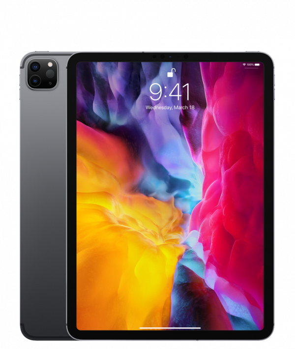
iPad Pro 12.9"
Apple
12.9-inch Liquid Retina display with ProMotion A12Z Bionic chip
iPad Pro 12.9"
Apple
12.9-inch Liquid Retina display with ProMotion A12Z Bionic chip
iPad Pro 12.9"
Apple
12.9-inch Liquid Retina display with ProMotion A12Z Bionic chip
iPad Pro 12.9"
Apple
12.9-inch Liquid Retina display with ProMotion A12Z Bionic chip
iPad Pro 12.9"
Apple
12.9-inch Liquid Retina display with ProMotion A12Z Bionic chip
iPad Pro 12.9"
Apple
12.9-inch Liquid Retina display with ProMotion A12Z Bionic chip
To create a three colum grid add .grid class to parent container div and arrange it according to your need with below utility classes.
- col-3-even : To evenly divide a row into 3 columns.
- col-3-left-expand : To divide a row into 3 columns where left column is stretched.
- col-3-mid-expand : To divide a row into 3 columns where middle column is stretched.
- col-3-right-expand : To divide a row into 3 columns where right column is stretched.
iPad Pro 12.9"
Apple
12.9-inch Liquid Retina display with ProMotion A12Z Bionic chip
iPad Pro 12.9"
Apple
12.9-inch Liquid Retina display with ProMotion A12Z Bionic chip
iPad Pro 12.9"
Apple
12.9-inch Liquid Retina display with ProMotion A12Z Bionic chip
iPad Pro 12.9"
Apple
12.9-inch Liquid Retina display with ProMotion A12Z Bionic chip
iPad Pro 12.9"
Apple
12.9-inch Liquid Retina display with ProMotion A12Z Bionic chip
iPad Pro 12.9"
Apple
12.9-inch Liquid Retina display with ProMotion A12Z Bionic chip
iPad Pro 12.9"
Apple
12.9-inch Liquid Retina display with ProMotion A12Z Bionic chip
iPad Pro 12.9"
Apple
12.9-inch Liquid Retina display with ProMotion A12Z Bionic chip
iPad Pro 12.9"
Apple
12.9-inch Liquid Retina display with ProMotion A12Z Bionic chip
iPad Pro 12.9"
Apple
12.9-inch Liquid Retina display with ProMotion A12Z Bionic chip
iPad Pro 12.9"
Apple
12.9-inch Liquid Retina display with ProMotion A12Z Bionic chip
iPad Pro 12.9"
Apple
12.9-inch Liquid Retina display with ProMotion A12Z Bionic chip