Cards contain content and actions about a single subject.
Cards are surfaces that display content and actions on a
single topic.
They should be easy to scan for relevant and actionable
information. Elements, like text and images, should be
placed on them in a way that clearly indicates hierarchy.
- In order to view the code you need to visit using a device with larger screen.
Text Only Card is the one that contains a title, a
descriptive text. To use the Card Component, card-title, and
card-text inside a div with class card.
Although cards can support multiple actions, UI controls,
and an overflow menu, use restraint and remember that cards
are entry points to more complex and detailed information.
Our changing planet
by Kurt Wagner
Visit ten places on our planet that are undergoing the biggest changes today.
Card with Badge contains a badge on the top-left, image, title, sub-title and details about the product.
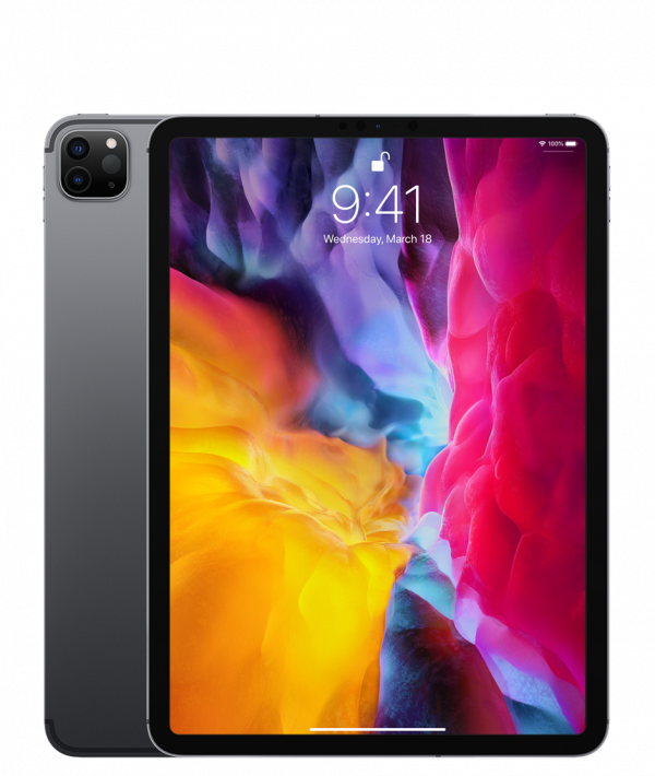
iPad Pro 12.9"
Apple
12.9-inch Liquid Retina display with ProMotion A12Z Bionic chip
A card with a Close Button contains a close button on the top-right of the card.
iPad Pro 12.9"
Apple
12.9-inch Liquid Retina display with ProMotion A12Z Bionic chip
Card with Text Overlay contains a text over the whole card, this kind of card is mostly used to shot disabled cards.
iPad Pro 12.9"
Apple
12.9-inch Liquid Retina display with ProMotion A12Z Bionic chip
Horizontal card takes a lot of space as its details are mentioned alonside it rather than having the details below it.
iPad Pro 12.9"
Apple
12.9-inch Liquid Retina display with ProMotion A12Z Bionic chip
A shadow can be given to a card by adding a class "shadow" on the card div.
iPad Pro 12.9"
Apple
12.9-inch Liquid Retina display with ProMotion A12Z Bionic chip